← Back to North of Eden
Concept 01 · Brand Case Study
Terra Solis.
A ground-up adaptogenic-wellness brand — built from a name and a feeling into a complete identity, a full packaging system, and a shop ready for the shelf.
A ground-up adaptogenic-wellness brand — built from a name and a feeling into a complete identity, a full packaging system, and a shop ready for the shelf.
A founder with a remarkable formula — and no world for it to live in.
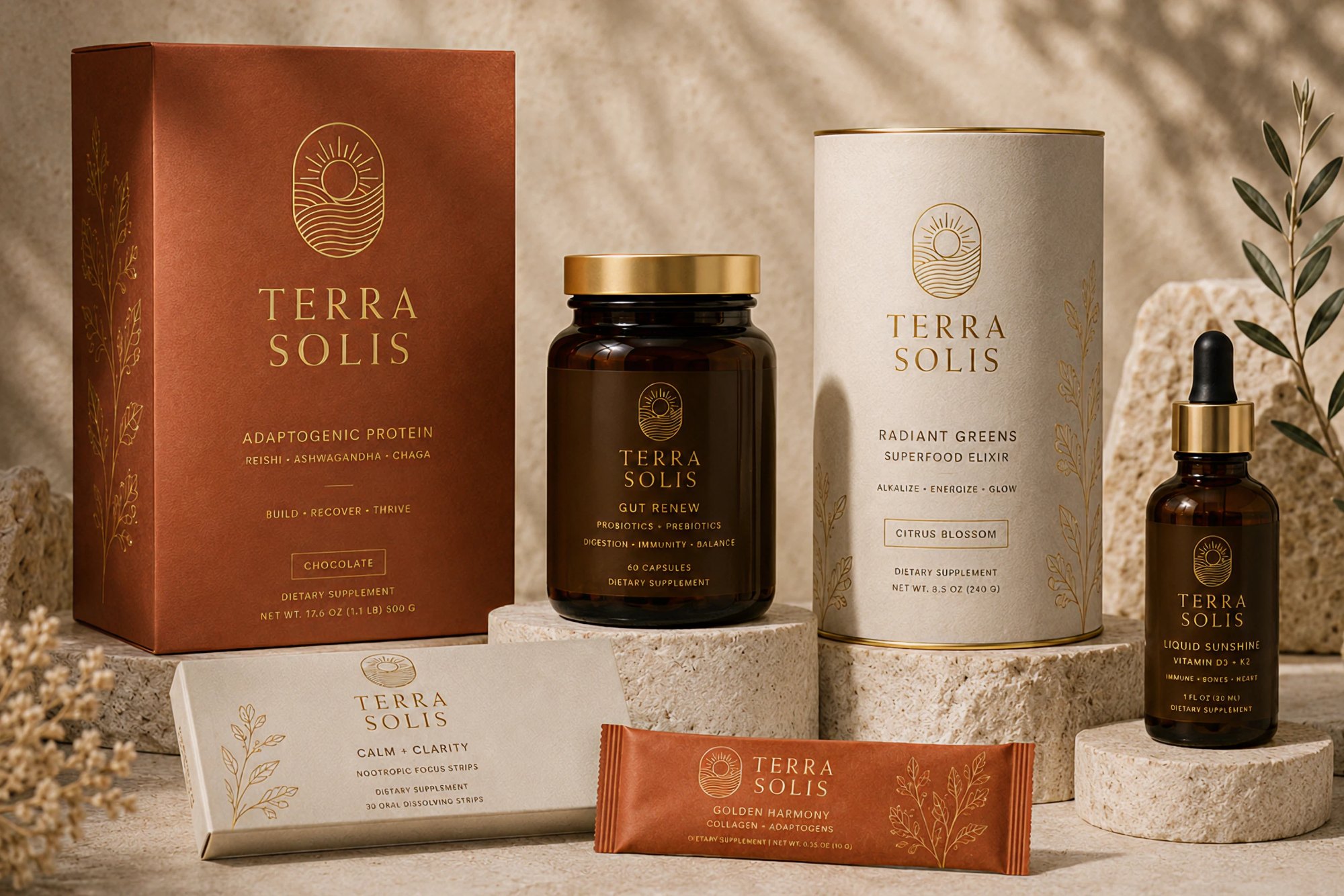
Terra Solis arrived as a chemistry: adaptogenic blends — reishi, ashwagandha, chaga — formulated for people who treat wellness as a daily practice, not a trend. The product was ready. The brand did not yet exist.
There was no name resolved, no mark, no palette, no packaging, no place to buy it. What there was: a conviction that supplements had become loud, clinical, and interchangeable — and a belief that this one could feel like sunrise instead of a pharmacy.
Our task was to build the entire world a product lives in — and to make it feel inevitable.
Not a supplement on a shelf. A ritual on the counter — something you reach for because you want to.
Before a single pixel, we wrote the positioning — "grounded energy." Terra (earth) and Solis (sun): the stillness of ritual met with the lift of vitality. Every decision that followed — the terracotta, the rising-sun mark, the unhurried typography — had to answer to that one idea.
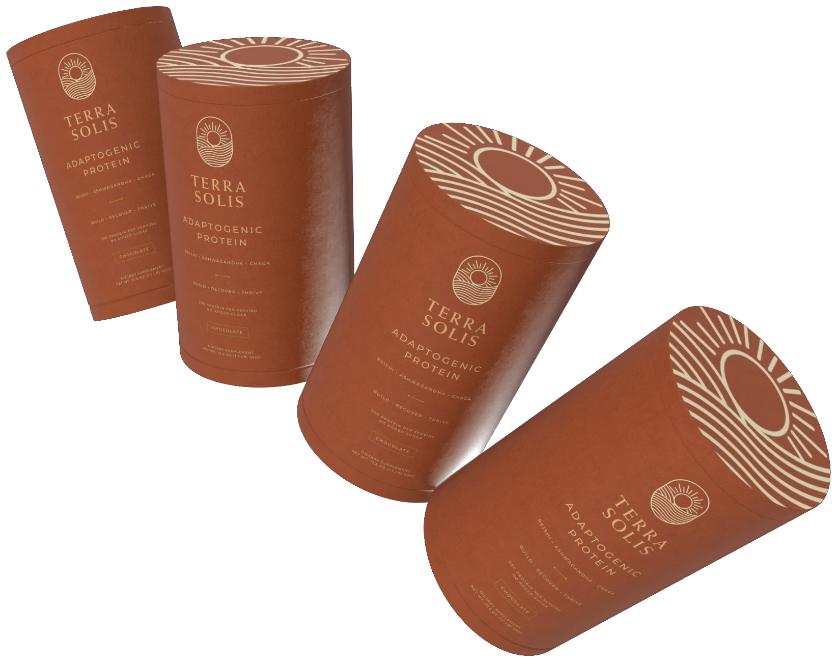

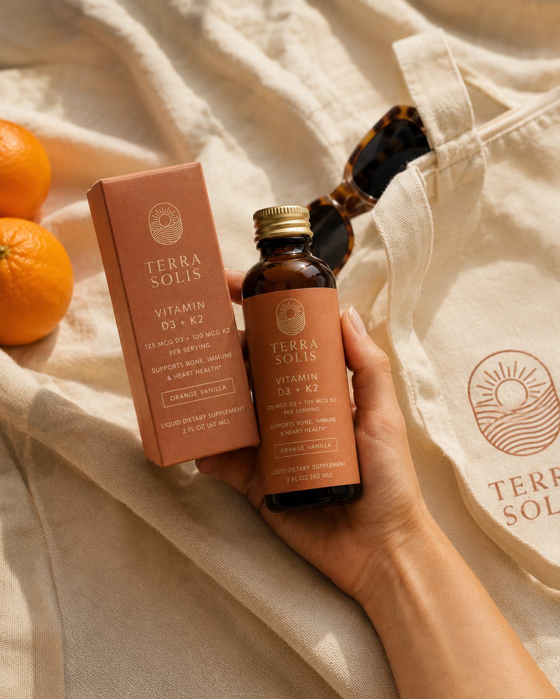
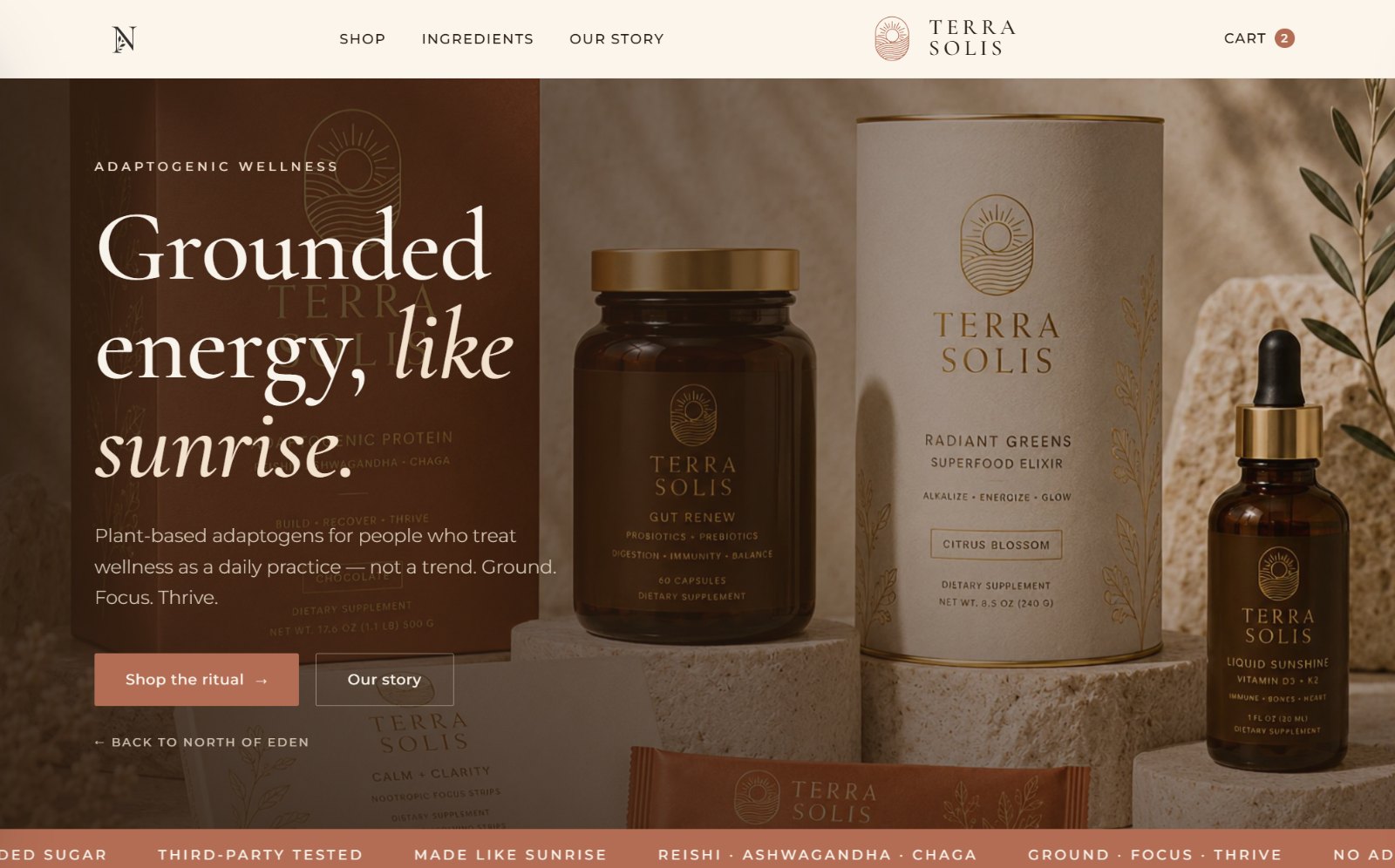
The emblem holds a sun rising over layered earth and water inside an arched frame — drawn in a single fluid line so it embosses beautifully on a matte terracotta canister. The wordmark is set in Weiss, a high-contrast classical serif with generous tracking: classic, calm, never clinical.
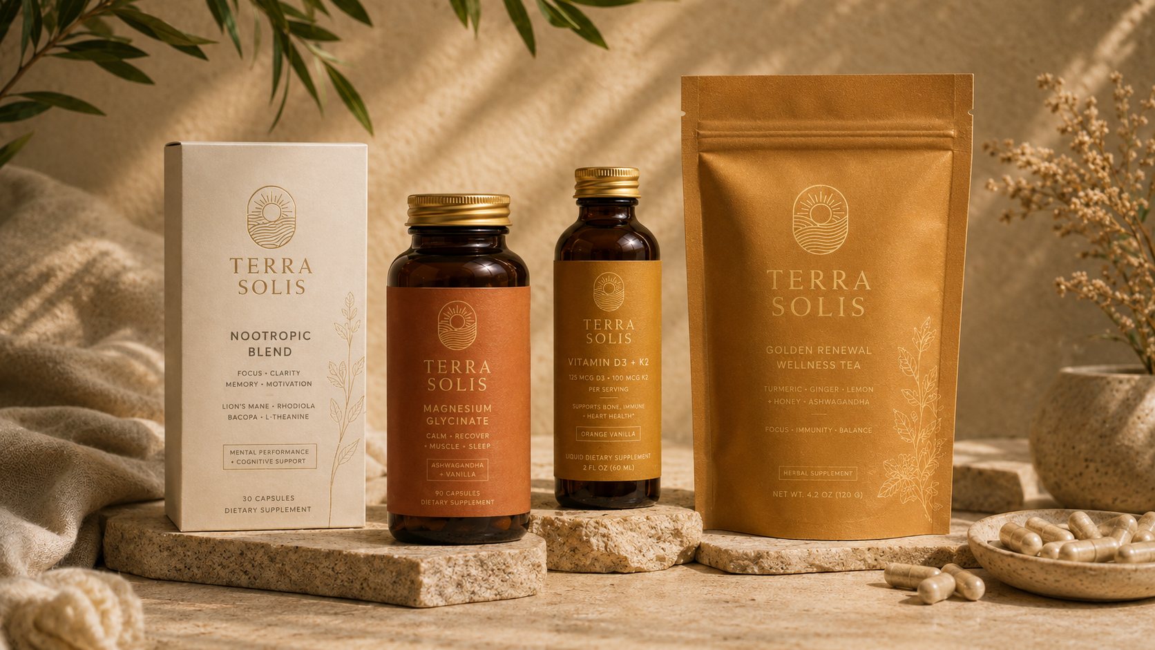
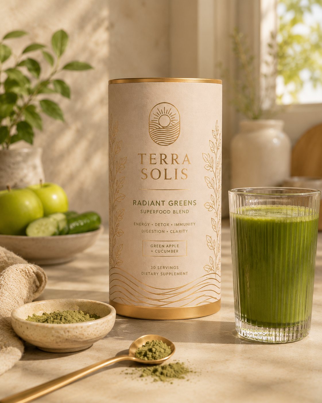
A pressed-paper canister, a folding carton with amber bottle, and a box of single-serve sticks — one identity system stretched across every structure, styled in warm, sunlit scenes that became the brand's whole visual language.
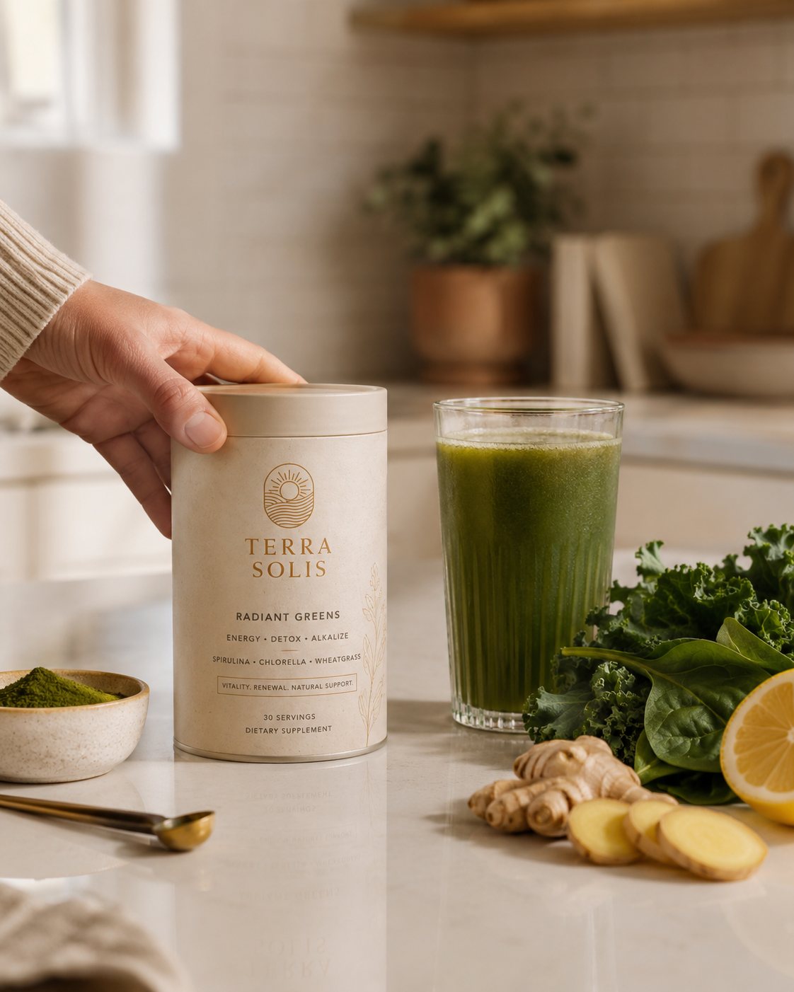
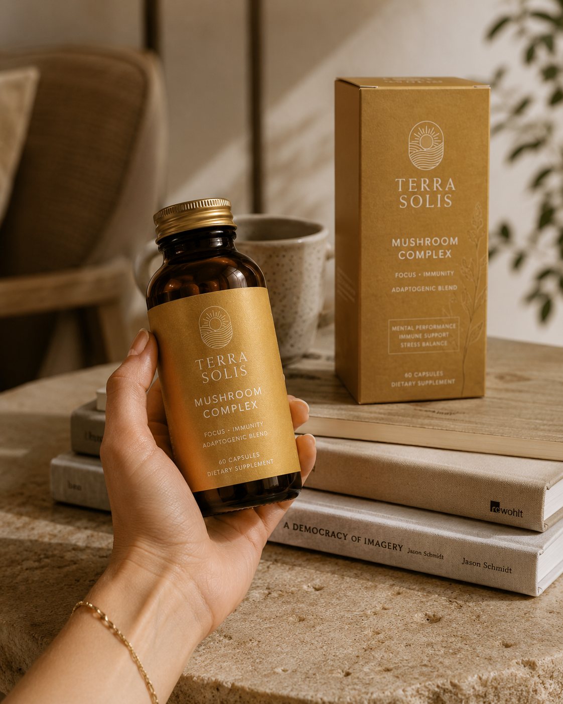
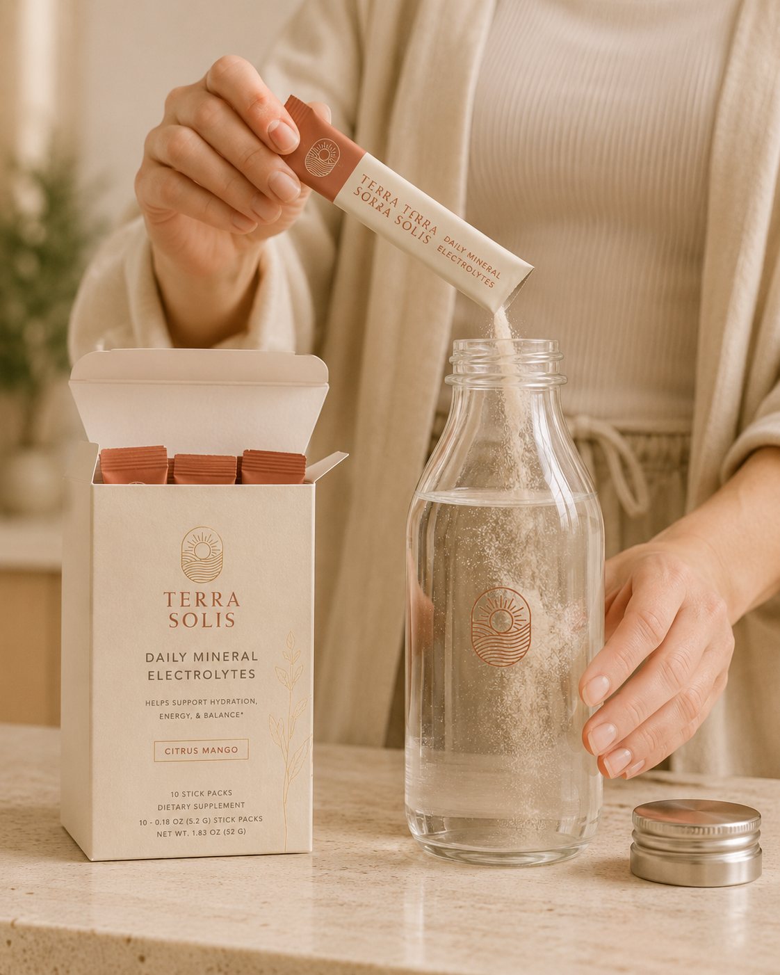
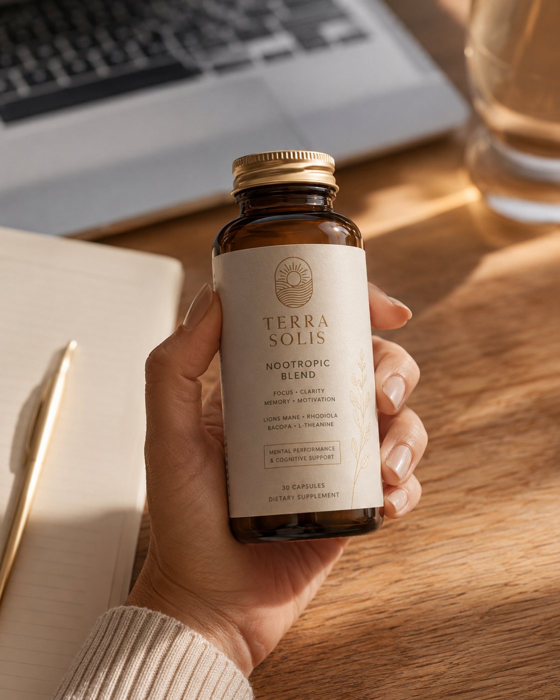
Every product was shot in warm, lived-in light — the morning counter, the desk at golden hour, the nightstand before sleep. The photography became as much a part of the identity as the mark itself.
The brand world resolved into a working shop: a homepage that opens like a sunrise, a collection grid, full product pages, and a cart — all carrying the same warmth as the packaging. Built to take a first order the day it went live.
We didn't design a label. We built the entire world the product lives in — and handed over the keys.